This blog is a map catalog in which I am displaying fifty different types of maps and a tid-bit of information that looks into the purpose of the map!

Star Plot

Star plots are the cousin of triangle plots, simply with more points. It is a multi-variable comparison where the values all add up to a single quantity. The star plot gives a visual representation as to how those values are distributes among the varibles. This example scores the taste of wine.


Found - http://www.avenuevine.com/movabletype/archives/BOLLA-MEZZACORNA-w.jpg

Correlation matrix

Correlation matrices were created to display the linear relationship between data sets. When the data is displayed in the matrix, the linear pattern becomes clear, as in the example below!

Similarity Matrix

Similarity matrices take similar data sets and put them in a matrix with eachother to illustrate the similarities, which become increasingly evident in matrix form. It has many biological applications, as seen here with this amino acid table.


Found - http://mendel.ethz.ch:8080/Server/ServerBooklet/_17545_tabular891.gif

Stem and Leaf Plot

Stem and leaf plots break down numerical data sets to organize similar data and give a graphic display of the distribution and median and mode of a data set. It is often used with data under the quanity of 100 to provide a simple overview.


Box Plot

The box and whisker plot looks at the quartiles of a data set and 'boxes' the median quartiles, leaving the 1st and 4th quartiles as the 'whiskers. It is a great map to use when looking at median values and ignoring the outliers.


Histogram

A histogram is a simple bar graph frequency distribution from which the height represents the frequency, and the position on the X-axis represents the varible. Histograms often form a bell-curve as there is one central median.


Found - http://www.graphicsserver.com/SampleApps/DotNet/General/Chart%20Types/Custom%20Charts/Histogram/Histogram.png

Parallel Coordinate Graph


Found - http://www.cse.ust.hk/~zhouhong/images/pc_clustering.JPG

This graph is another map graph that is used to compare multivariate data, typically with several data sets in comparison. The data is all set over a shared coordinate system, and measured by the same scales. Here is a very colorful example done simply as an example in computer graphics.

Triangular plot

A triangle plot, also known as a ternary plot, is a graph type that looks at three variables, who combine to a constant sum. The three are fractions of the whole, and the graph is used to visualize the proportions of the three varibles.


Wind Rose

The wind rose is used by scientists and meteorologists to see the distribution of wind direction and speed over a given area. The wind rose can give way to weather patterns, Florida is a perfect example, as we all know the perals associated with wind coming in from the east and south!

Climographs

Climographs graph the temperature and precipitation of a region over a given time period, often one calender year. These graphs are used to give way to the trends and patterns in the weather of a chosen region, such as the one for Manaus below.


Found - http://www2.volstate.edu/kbell/BrazilClim.jpg

Population Profile

Population profiles take a look at the population dispersion in a specific region, often an entire country, state or provence. It can be the the population of any species, but is most often used in human populations. Population profiles are rich with information, telling everything from the estimated population growth, to the living condition, even the economic condition.


Found - http://dt.jorgecamoes.com/images/2007/09/population_pyramid_africa_96.png

Scatter Plot

This is one of the most basic types of graphs, simply a data se of two varibles graphed in terms of each other. This one looks at the quality of a class vs. its credit value taken by students at Coumbia University.


Found - http://www.stat.columbia.edu/~cook/movabletype/archives/scatter.png

Index Value Plot

Index value plots have a base index and graph a data set along that value, this is seen a lot when using a data set to figure out a trend line, such as a linear growth or decline, or a bell curve or sinosodal pattern in the data.


Found -http://www.scielo.br/img/revistas/jbchs/v15n2/19932f4.gif

Accumulative Line Graph or Lorenz Curve

Lorenz curves actually haunt me in my sleep at times as an Economics major. They are most often used to determine the measure the inequality of a population based on the income of the population. They can be used to derive important figures to the study of economics such as the Gini coeffecient (seen below).


Found - http://450.aers.psu.edu/images/gini.gif

Bilateral Graph

Bilateral graphs are simply graphs made to be bilateral due to the fact that they display both positive and negative values with 0 as a common axis. I commonly see such a graph in my line of work with the measurement of G-forces in vehicles. They can be analyzed in a side-to-side fashion when analying track data, or in an acceleration-deacceleration term depending on what is needed to be seen from the set.


Found - http://www.thedieselpage.com/features/pulloff06-022c.jpg

Nominal Area Choropleth Map

Nominal area choropleth maps focus on displaying a data set that does not necessarily have a quanitative focus. The same standards for choropleth maps are in place, and generally numbers are absent from the map.


Unstandardized Choropleth Map

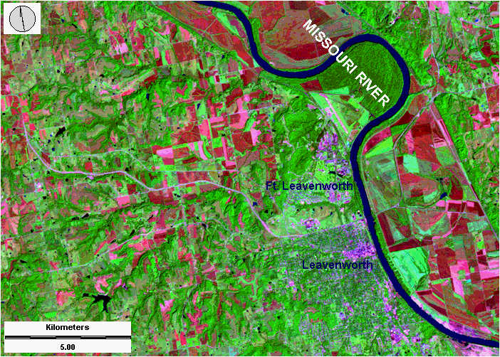
Unstandardized choropleth maps go the opposite direction of standardized maps, they do not have a ranking or order to their data, merely displayed data. This makes them far less common or used as they can be more involving for the reader to understand.


Found - http://upload.wikimedia.org/wikipedia/commons/thumb/9/9b/US_Map_Same_Sex_Marriage_Laws.png/800px-US_Map_Same_Sex_Marriage_Laws.png

Standardized Choropleth Map

Standardized maps used a standardized data set, or data set that is ranked to allow an easy base for comparison. The choropleth aspect pushes the dataset to be color coded, such as the map below illustrating population sizeds.


Found - http://upload.wikimedia.org/wikipedia/commons/0/06/Kentucky_population_map.png

Univariate Choropleth Map

Univariate choropleth maps are just as the name implies, a choropleth map that displays a single variable. These are some of the most common thematic maps used, often for population or census related data, such as below. The use of shading makes it very easy to display a data set for the reader.


Found - www.mapsofindia.com

Bivariate Choropleth Maps

Bivariate maps are maps that display two varibles in the same mapping field. This is commonly seen in choropleth maps, where different colors can easily distinguish the different variables. This example looks at several commonly mapped variables in mapping that have a strong correlation. Because of this correlation, this form of mapping is an excellent venue to choose.


Found - www.worldpolicy.org

Unclassed Choropleth Maps

Unclassed choropleth maps run on the same basis as other choropleth maps, but lack the the data classification of classed maps. They have not been widely accepted because of the fact that in turning away from the standardization of classed choropleth maps, they have isolated themselves in a less understood faction of mapping.


Found - www.sfu.ca

Classed Choropleth Maps

Classed cloropleth maps the data scale is grouped in standardized classes, so that in comparing diferent regions or areas, the same classes and color schemes allow for an easy comparison of the similarities and differences. The example below looks at the population percentages, breking them down into a commonly used class structure.


Found - http://media-2.web.britannica.com/eb-media/10/70010-004-BBFE93FB.gif

Range graded proportional circle map

Virtually the same as a continuously variable proportional circle map, these maps use a different that involves a specific range to define standard size circles rather than the continuously variable set-up. There will only be a set number of circle sizes rather than the infinate set available with continously variable.


Found - http://images.google.com/imgres?imgurl=http://www.santos.com/library/west_natuna.gif&imgrefurl=http://oilismastery.blogspot.com/2008/09/myth-of-subduction.html&usg=__qRCqcNl-jjm6579msVwvomfh_s0=&h=640&w=482&sz=11&hl=en&start=42&um=1&tbnid=1YUAP3nnqn0HIM:&tbnh=137&tbnw=103&prev=/images%3Fq%3Dnoa%2Brelocated%2Bmap%26start%3D40%26ndsp%3D20%26um%3D1%26hl%3Den%26sa%3DN

Continuously Variable Proportional Circle Map

Continuously variable proportional circle maps are a slightly more complex version of a proportional circle map. This version uses a scale to give the reader more insight to reference an actual number associated with the size of the circle, without losing the quick reference of size that a proportional circl map provides.


Found - www.padesatprocent.cz

DOQQ

DOQQ, or digital orthophoto quarter-quadrangle, is an extremely high resolution aerial photograph, taken from a plane or satellite in the infrared spectrum. Then it is digitalized at a very high resolution to create an image of incredible accuracy. These images are very useful because they are proportional and georeferenced, so they are as accurate as if you were viewing the image. Below is an example in works with ArcMap.


Found - www.pasda.psu.edu

DEM

DEM, or Digital Elevation Models, are a furthered look into the world of GIS. They are a sompletely digital terrain representation obtained by using a very high-tech system of cameras and remote sensing technology. It is technology that is so impactful, it has found itself in satellites and the Rover's Spirit and Oppurtunity sent to Mars.


Found - www.pasda.psu.edu

DLG

DLGs, or Digital Line Graphs, are very similar to DRG's, however instead or useing the raster, 'dot' or pixel style of creating a GIS image, these use 'line' or vector data to create their representation. Below is a perfect example of an image created using the very populat ArcGIS system, specifically ArcView, which can create both raster and vector images.


Found - http://pubs.usgs.gov/of/2003/of03-471/graphics/omeara/fig3.jpg

DRG

DRGs or Digital Raster Graphics, is a GIS creation using a topographic map and digitializing it at a very precise rate, the standard being 250 dpi. When digitalized, the map can recieve further enhancements, such as the example below, wher the map has been given simulated elevation to help further its understanding.


Found - http://pubs.usgs.gov/of/2003/of03-471/graphics/omeara/fig3.jpg

Isopleth

Isopleth maps combine features of numerical data and line contouring to create a more complete thematic expression. Often incorpirating color, isopleth maps can display a gross amount of data in a clean, contemporary fashion. Below is a perfect example, encompassing all of the above attributes to achieve its goal of displaying the Total precipitation amounts in 2007.


Found- www.dwb4.unl.edu

Isopach

Unlike the rest of its 'iso-' cousins, Isopach maps do not pertain specifically to a meteorology aspect of mapping, they actually serve a much lower purpose. Isopachs pertain to depth and thickness of a geological layer. Often used to determine depths of shale, clay or bedrock in the aide of mining, farming, or oil drilling.


Found - www.pubs.usgs.gov

Isohyets

These maps display rainfall over an area with use of contouring lines. Levels of similar rainfall share the same contoured areas, and with color coded maps such as the one below, share teh same shading to distinguish themselves and their repsective data.


Isotachs

Isotachs are lines on a given map that indicate both the direction and velocity of windspeed. Often used in conjunction with isobars, the two combine to provide powerful insight as to exact atmospheric conditions. Wind speed variance is shown through sometimes through the tails of the arrows, such as below, or sometimes in the size of the arrow. The direction is shown through the way that the arrow points as the direction the wind is heading.


Found - www.sabah.gov.my

Isobars

Isobars are conrouring lines that display atmospheric pressure and give way to the areas that share the same air pressure. These, combined with isobars are incredibly important in fields such as meteorology or aviation, as the pressure and direction of the atmosphere divulges much about current and future weather.


Found - http://cws.met.psu.edu/members/images/ridge.jpg

LIDAR

Light Detection and Ranging is similar to doppler, but utizes laser pulses vs. the microwaves of doppler. THis use of light provides increased speed and accuracy, as well as using much shorter wavelength light, therefore is less prone to distortion as it passes through the atmosphere. LIDAR provides such ultra accurate precision that is widely used in military application as a replacement for doppler.


Found - http://vulcan.wr.usgs.gov/Volcanoes/MSH/Eruption04/LIDAR/Images/LIDAR_msh_new_dome_area_09-03.jpg

Doppler Radar

Doppler radar is the use of doppler effect from outsent microwaves. Doppler is the primary tool of weather forecasting as it can determine precipitation and windspeed along with cloud cover. Doppler is a science advancing all the time, and is found in fields ranging from police radar guns to air traffic control.


Found - http://mirror.bom.gov.au/weather/radar/about/images/doppler.gif

Black and White Aerial Photo

Black and white aerial photos are shots taken at a satellite or lower level. They are the oldest for of GIS, and the beginning of a new era in cartography mating the emergence of aerial technology and mapping. First used by the military, uses spread quickly, here it is used to display property lines of interest


Found - http://www.horschgallery.com/admin/uploads/Products/Product326/bw29-black-white-wrigley-field-aerial-picture-photo-print-framed.jpg

Infrared Aerial Photo

Infrared technology gave a whole new face to cartography. By utilizing the infrared light spectrum in photography, mappers can better isolate specific features for comparison or contrasting. Colored infrared, such as the one below can even us color to reall make an image stand out!


Found - http://www.outintheboonies.com/Hal_Scott/doq_map.jpg

Cartographic Animation

Cartographic animations promote an easier understanding of a thematic map by taking it to the next level with the ability to display the data in terms of another variable, often time. Used everyday in weather forecasting, this animation has reached a new height with the advent of GIS.


Found - http://i37.tinypic.com/fnd7bc.gif

Statistical Map

Statistical maps are really a staristical graphic overlayed on a mapped surface. They are efficiently used to display numerical data over a selected region.


Found - http://images.google.com/imgres?imgurl=http://www.deepinfo.com/WorldGrid_1.jpg&imgrefurl=http://www.deepinfo.com/WorldGrid.htm&usg=__lCzKOwRrWt5AqV3rb38pgbkJOhA=&h=506&w=660&sz=102&hl=en&start=6&tbnid=31pQ8tHk53W4OM:&tbnh=106&tbnw=138&prev=/images%3Fq%3Dnumbered%2Bworld%2Bmap%26hl%3Den

Cartogram

Cartograms are incredibly interesting because of the fact that they substantialize the thematic data set in the map over area. Political boundaries are still held, but area is distorted to show the comparible size of data in relation to the physical size of the area studied.


Found - www.nytimes.com

Flow Map

Flow maps focus on showing the movement or migration across a geographic plane. Theyare more specific, often in a thematic form, and can be overlayed on virtually any map type.


Found - www.solcomhouse.com

Isoline Map

Isoline maps are thematic maps that use conjoining lines to group together similar data. They are very commonly seen with situations like the one below, where an isocline extends beyond traditional political or geographical boundaries.


Found - www.personal.uncc.edu

Proportional Circle Map

Proportional circle maps are similar to dot distribution maps, with an added element. The sizes of the dots vary with size in proportion to the data displayed in the given boundaries. This map looks at population sizes a French provence. The size of the dots give a quick reference to the population sizes, though exact accuracy is not expressed.


Found - www.stat.columbia.edu

Choropleth Map

Choropleth maps are themeatic maps that use color coding or shading to display data concentrations. A key is needed to determine map coding, as each map has a specific shading with relation to its own data.


Found - http://www.ers.usda.gov/AmberWaves/May07SpecialIssue/Findings/Charts/Findings_greene_fig01.gif

Dot Distribution Map

Dot distribution maps show spreads across a given area, often used utilized with populations, dot distribution maps do an excellent job of showing the dispersion of a population.


Found - www.ncaction.org.uk

Propaganda Map

Propganda maps take many forms, but have the same purpose, to incite a specific line of thinking about a specific subject. Often associated with war time, such as the classic example below, propoganda maps can truly concern any subject, from politics to sports.


Found - http://www.calvin.edu/academic/cas/gpa/posters/map.jpg

Hypsometric Map

Hypsometric maps enhance topograpical maps by means of shading. Shading different elevations with different colors can make the map much easier to read in an area of varying elevation. Often used in mountain or coastal regions to show the changes in elevation.


PLSS Map

PLSS maps, or Public Land Survey System maps, are used to display and divide public domain lands. It is often overlaid on a topographical or planimetric map for a complete land overview. The example below is the county map of my great home state of Kentucky!


Found - www.student.britannica.com


Cadastral Map

The cadastral map is a comprehensive map of property boundaries, often county or country lines, these maps can go as specific as individual property.


Found - www.commons.wikimedia.org

Thematic Map

Thematic maps focus in on a specific theme or attribute over a displayed region, often projecting it over a standard topographical map. We see a GIS program below that has created a map that compares methane output from rice production.


Found - www.epa.gov

Blog Archive

  • 9 (2)
  • 12 (52)